

Fonts, colours, corners, spacing. Build as many styles as you like, point them at whichever widgets you want, and change your mind later without touching a single article.
Rui Correia Posted
A price comparison block that looks like it was bolted on from somewhere else converts worse than one that looks like part of the article. Readers notice, even when they couldn’t tell you what they noticed.
So widgets are styleable. The bit worth understanding first is that you don’t get one setting — you get as many styles as you want to build.

That matters more than it sounds. A style that suits a phone round-up doesn’t necessarily suit a washing machine comparison, and a style that works in the body of an article won’t work in a sidebar. Build one of each and pick per placement.
Building a style
Click New Style. Three decisions on the way in.
- Name it — you’ll be choosing between these later, so “article body” beats “style 2”
- Choose which widget types it applies to, or all of them
- Decide whether it’s the default for those types
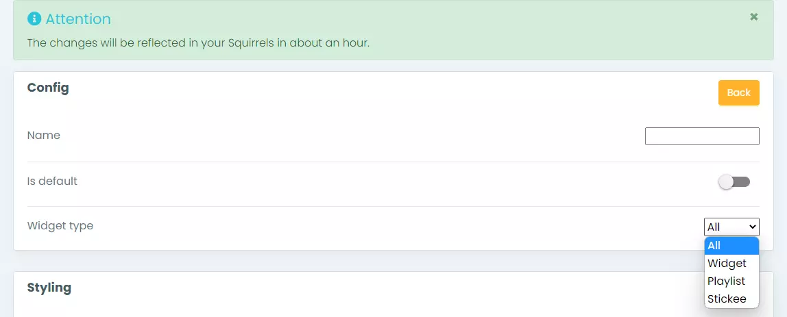
The default is the one that does the work. Set it and every widget of that type picks it up, across every article, including ones you published years ago. Anything you don’t set as default sits there until you ask for it by name.
The three panels
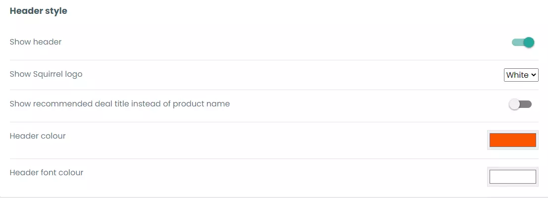
Header style. Whether to show the header at all, and the header and font colours if you do.
Content settings. What actually appears in each row — RRP, offer price, retailer logo, product image — plus the colours behind them.
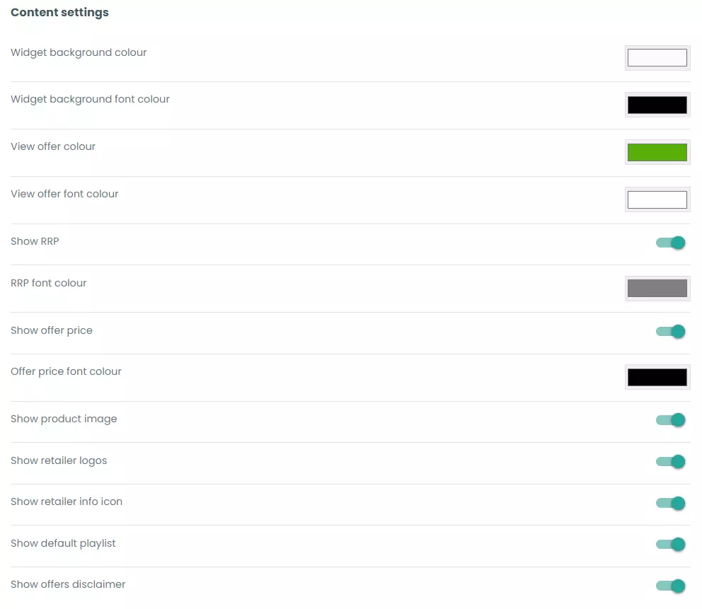
This is the panel to spend time in. Everything else is cosmetic; this decides how much information a reader gets before they click. Showing RRP alongside the offer price makes a saving visible, which is the whole argument for putting a price table in an article. Retailer logos do more than you’d expect, because readers have accounts with particular shops and recognising one removes a step.
General settings. Font family and size, and the dynamic height option.
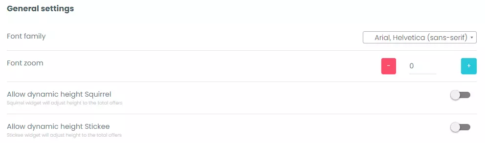
Dynamic height
Worth its own heading because it’s the setting people miss.
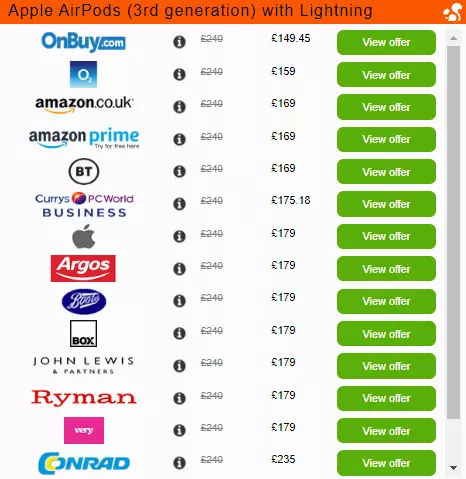
Off, the widget is a fixed size whatever it contains, so a product stocked by three retailers sits in a box built for six.
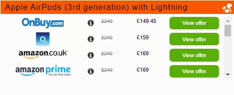
On, it fits itself to however many offers there are.
If you’d rather write your own CSS
There’s an option for that, and it overrides everything you’ve set in the dashboard.

Useful if your design system is strict and you want the widget inheriting from it rather than approximating it. Just know that once you’re in here, the panels above stop mattering — which catches people out when someone else on the team later wonders why the colour picker does nothing.
Getting it onto the page
If the style is set as default, nothing to do. Your existing embed code picks it up.
If it isn’t, you name it. Pick the style on the widget, hit Preview, then open Embed Codes.
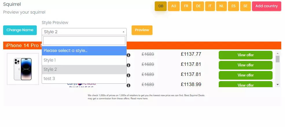
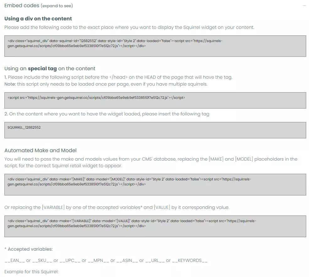
The code carries the style ID, so the widget renders in that style wherever you drop it. And there’s a live preview at the bottom of the style page while you’re working, across every widget type, so you can see what you’re doing before it goes anywhere near an article.
What’s actually worth changing
Build as many styles as you like, point them at whichever widgets you want, and change your mind later without touching a single article. Three things earn the attention.
The typeface. Matching your body font is the single change that makes a widget stop looking like an advert. Nothing else comes close.
The header. Ask whether it’s earning its space. In the middle of an article the surrounding copy has usually already said what the block is, and the header is just a bar between the reader and the prices.
What’s in each row. Every field you show is information the reader doesn’t have to click to get. Every field you hide is a reason to click, or a reason to leave. That trade is worth thinking about properly rather than accepting the default.
The rest — corner radius, padding, border weight — is ten minutes and then leave it alone.
Where to go deeper
Improving your affiliate call to action covers button text, which sits outside the styling page but is the other half of making a widget work.
Common questions
Can I change how Squirrel widgets look?
Yes. You can build any number of named styles controlling typography, colours, the header, spacing and which product fields appear, and either set one as the default or apply it to individual widgets.
Do styling changes apply to articles I’ve already published?
If you change the default style, yes — every widget of that type updates, including ones in articles published years ago. Styles that aren’t the default only apply where you’ve named them in the embed code.
Can I use my own CSS instead?
Yes. There’s a custom CSS option, and it overrides everything set in the dashboard.
What is dynamic height?
It sizes the widget to the number of offers it’s showing, rather than holding a fixed height and leaving empty space when a product is stocked by fewer retailers.